OTKit

Company
OpenTable
Team
Product design and brand
My role
Product designer
Website
Design tokens - Style guide
Goals
Build a design system with solutions that span both sides of the business. Reorganize design hand-off with development to give teams confidence to make decisions on their own.
Challenges
Create a consistent baseline to improve user experience, streamline workflow between design and development, and nurture a flexible system we can evolve.
Design system principles

Making design decisions can be difficult. Using principles can help get everyone on the same page. An outcome of our design system process was creating principles that helped people focus on a larger vision. Using common terms helps facilitate communication.
Typography
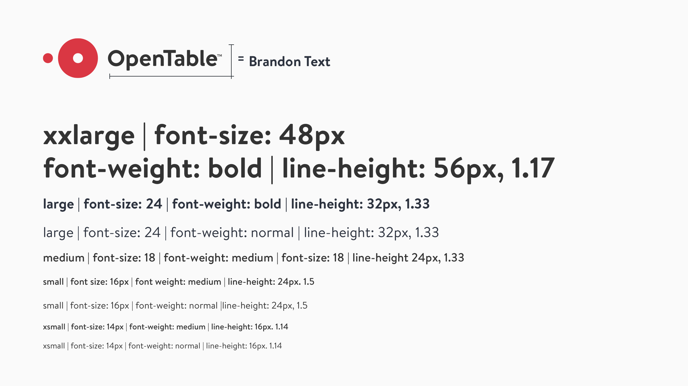
Font
Establishing a typographic system started with our brand. We used our brand font as a stepping stone. The next steps for the evolution of this system are currently in development, including using system fonts within native platforms and a catch-all solution for localization.
Color
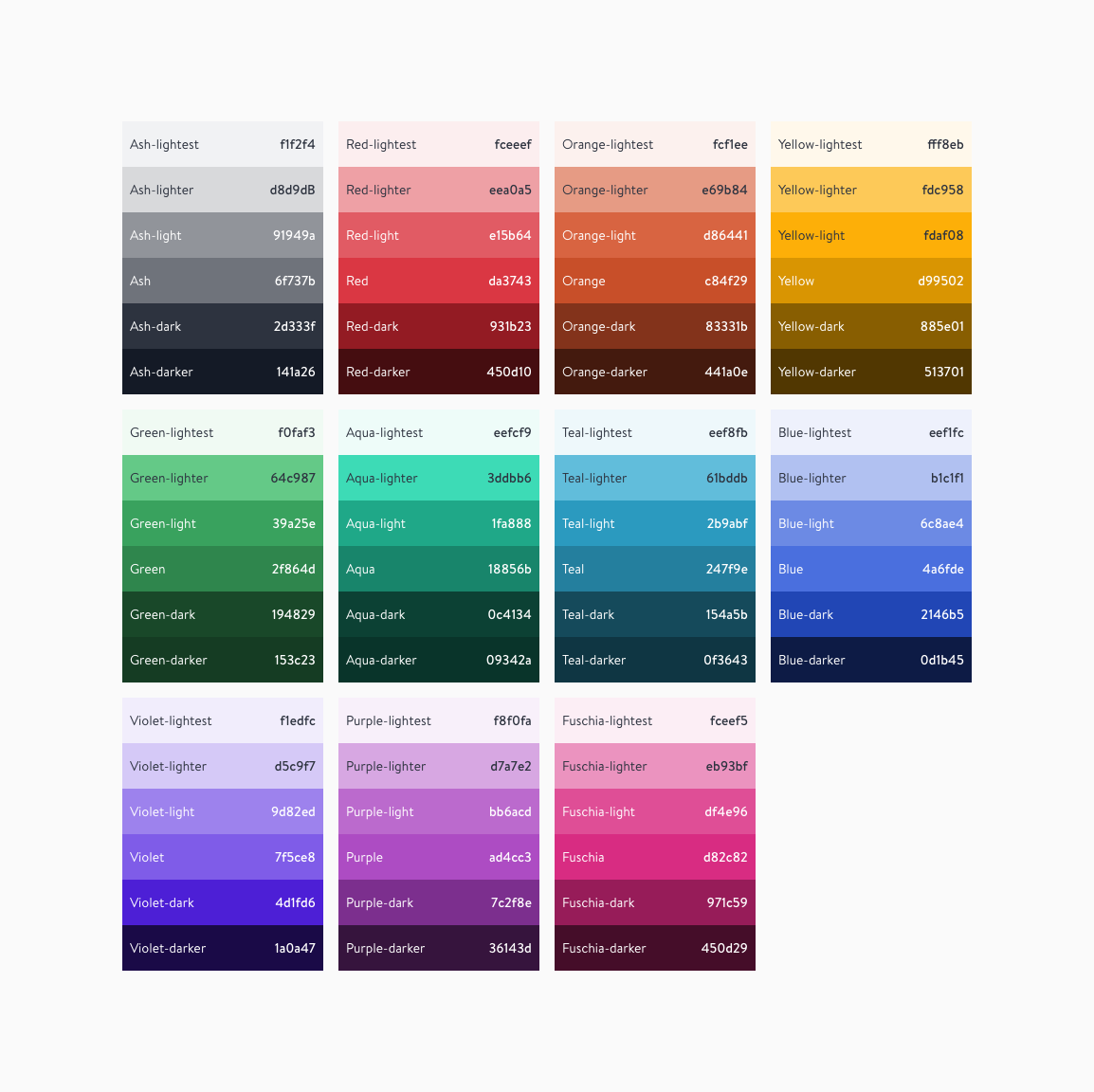
Color palette
This is the OTKit color system. I worked in close collaboration with brand designers, product designers, and development. The model is built with flexibility so that it can be adjusted and improved when gaps are exposed.

Core
The core colors are composed of OpenTable red and nine additional colors that meet the same contrast ratio (4.56) based off our most complex UI product use cases.
With the exception of yellow, using a core set that maintains WCAG 2.0 compliance provides us with UI flexibility.
Color schemes
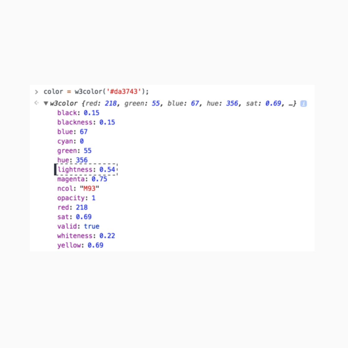
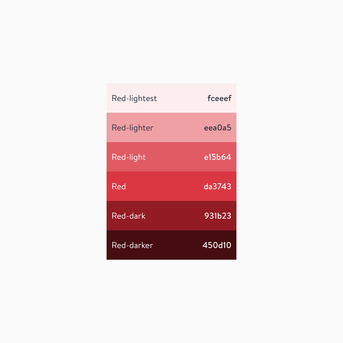
The monochromatic color scheme is built from the core color group using the H S L color model.
Using this color model, we calculate lightness increases and decreases to build a monochromatic color scheme.
This solution provides flexibility to build UI color patterns in something simple like a button component or something as complex as a data visualization system.
Color naming
We use non-functional naming for two reasons:
- Clear communication between design and development
- Non-functional naming is “more intuitive if the "set" of colors is complete and variable names are predictable” - Vincent (development)
This naming uses light and dark rather than numbers, giving us control so that the color groups don’t expand arbitrarily.
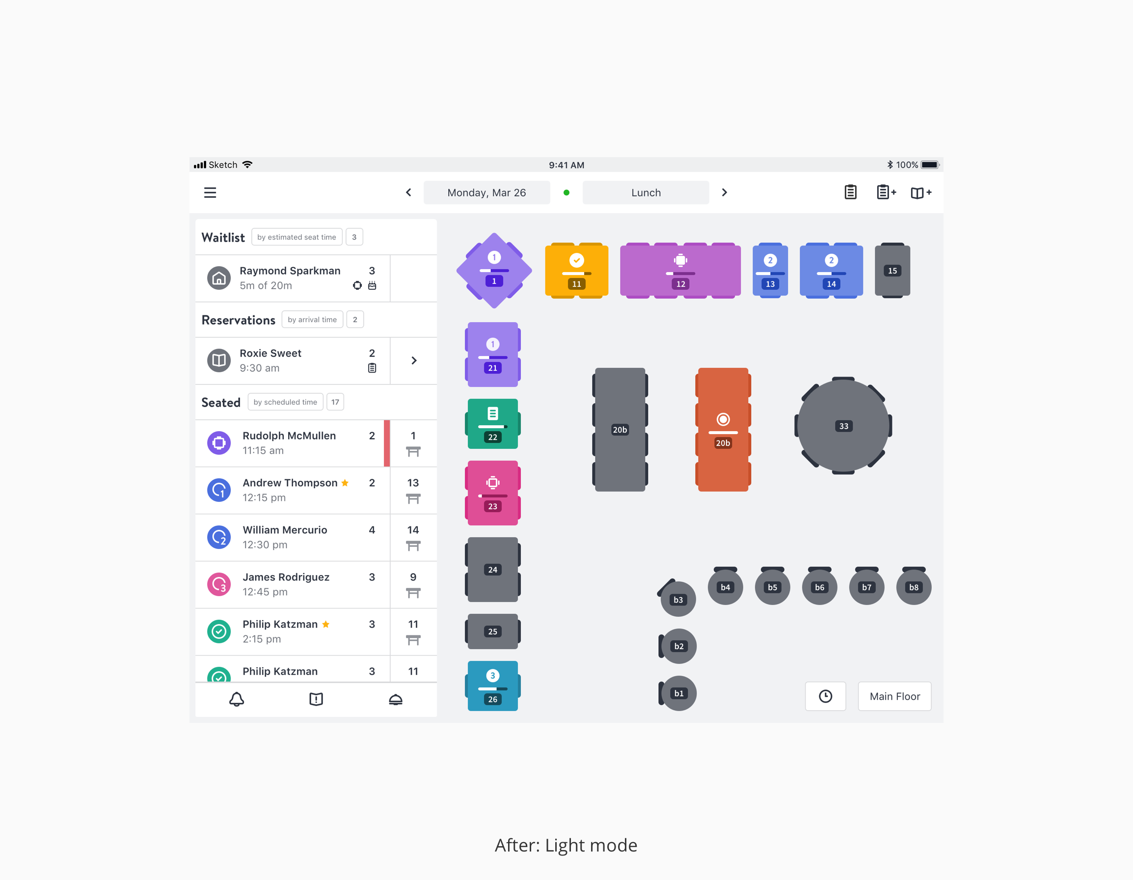
Product use case
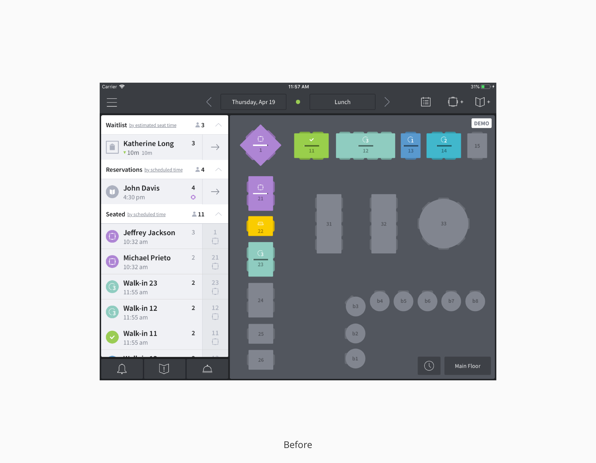
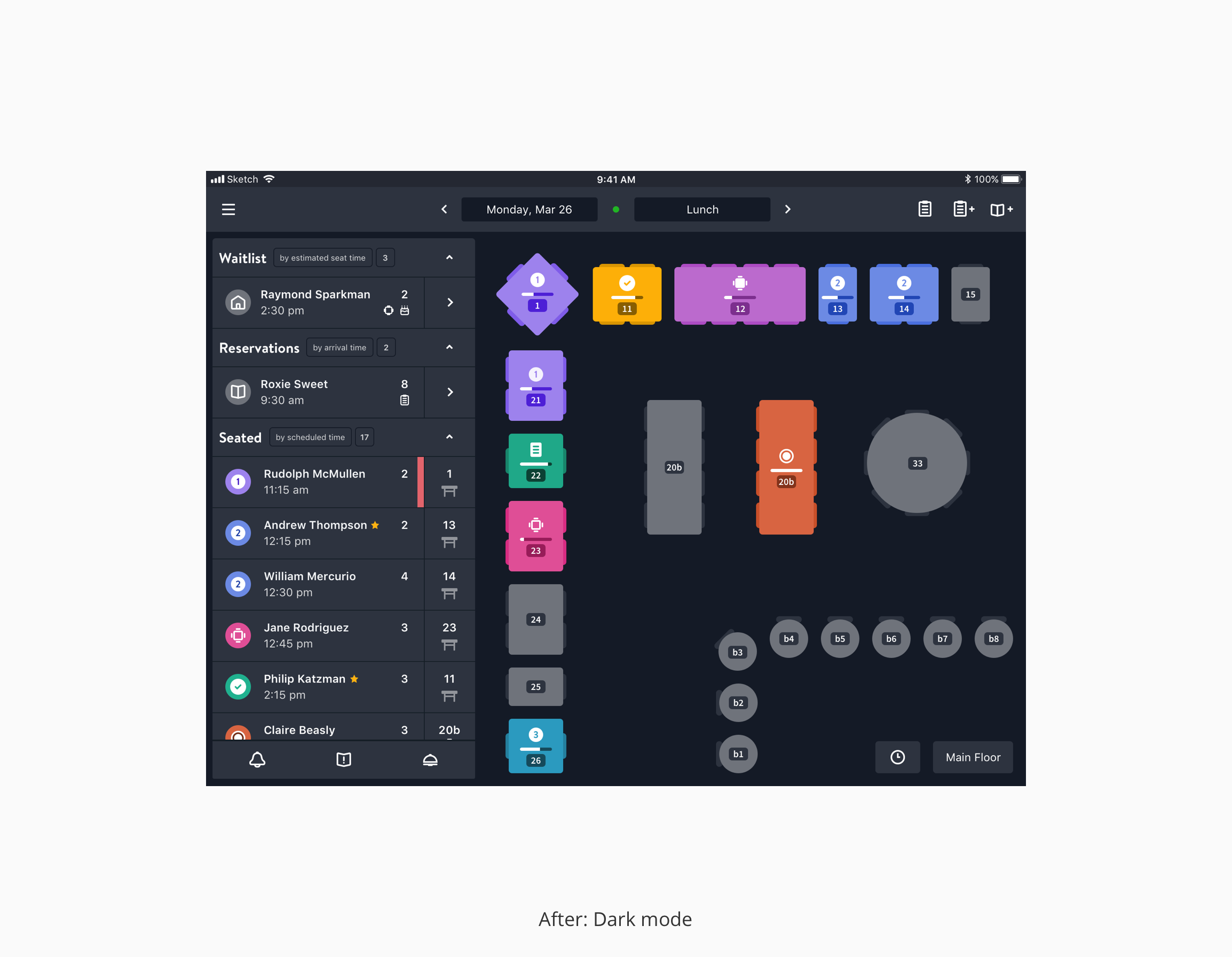
To stress test the product UI color system, we applied it to our most complex use case. The result was a solution that solved for color on both dark and light user interfaces.
Spacing units
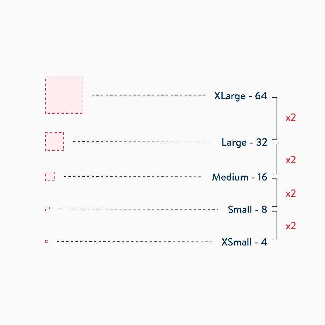
To help with design team velocity with layouts and building symbols in Sketch, we created a set of spacing units using geometric progression.
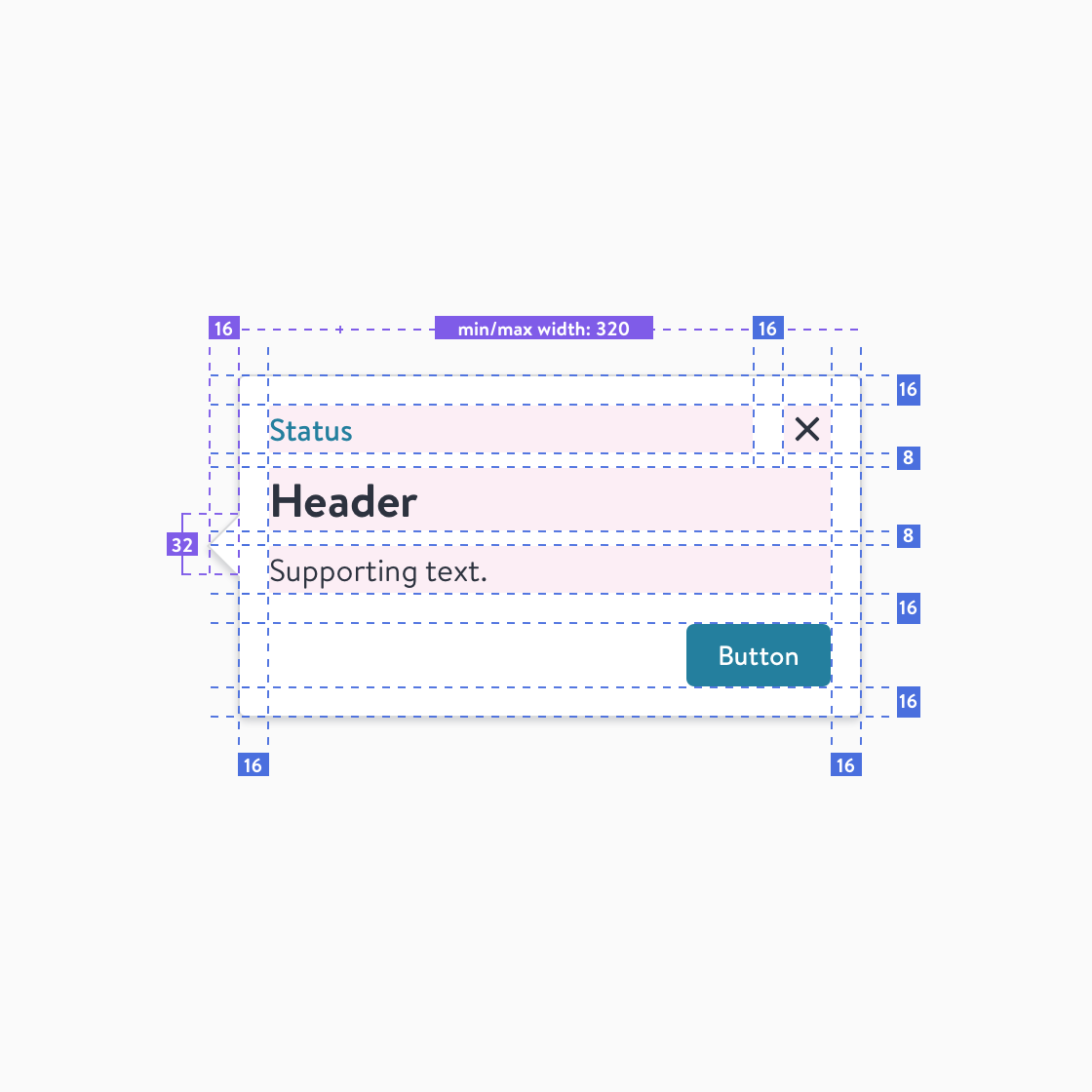
The use of spacing units enables designers to make decisions quickly and helps development teams make decisions with confidence, especially if there are disparities at hand-off.
Iconography
System icons
The intended use of this icon library is to provide users with clarity in OpenTable’s product experiences. The style is driven by the soft rounded corners from our brand font, Brandon Text.
Rules
For consistency we created a set of rules to use when building icons to enable the design team to act independently.
Repository
In collaboration with our development team, we created a repository for our icons to centralize a single source for consumptions across web teams.
Design tokens
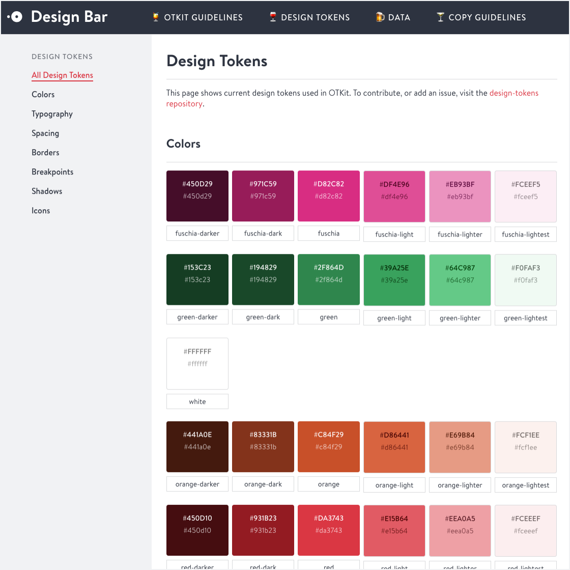
A library of available design decisions has been our greatest victory. These decisions are connected in our design tooling and in development with opportunity for evolution that doesn’t require starting from the beginning.
Grid
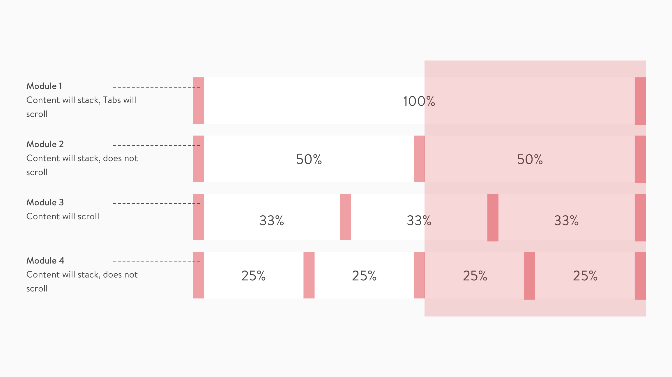
Percentage based model
This is an example of one of our grid systems. All grids use fixed margins and flexible percentage based columns. Margin widths are decided by spacing units. This system supports hard and soft grid solutions.
Conclusion
This process has taken a good amount of investment to build and communicate, with plenty more to do. Design systems are ever-evolving. Our system started as part of a redesign on our consumer product and this evolved into a visual language that is being leveraged across all design teams. When we started we didn't have much, except large color libraries on each platform. We didn't have the building blocks, foundational rules, sketch library, or a process. Now teams are pushing the rules as new use cases arise and are bringing sound arguments to the table for iteration as we reconcile and deprecate patterns. Our foundation is connected to our design token library for available consumption and we're now investing time in native platforms.
Selected works
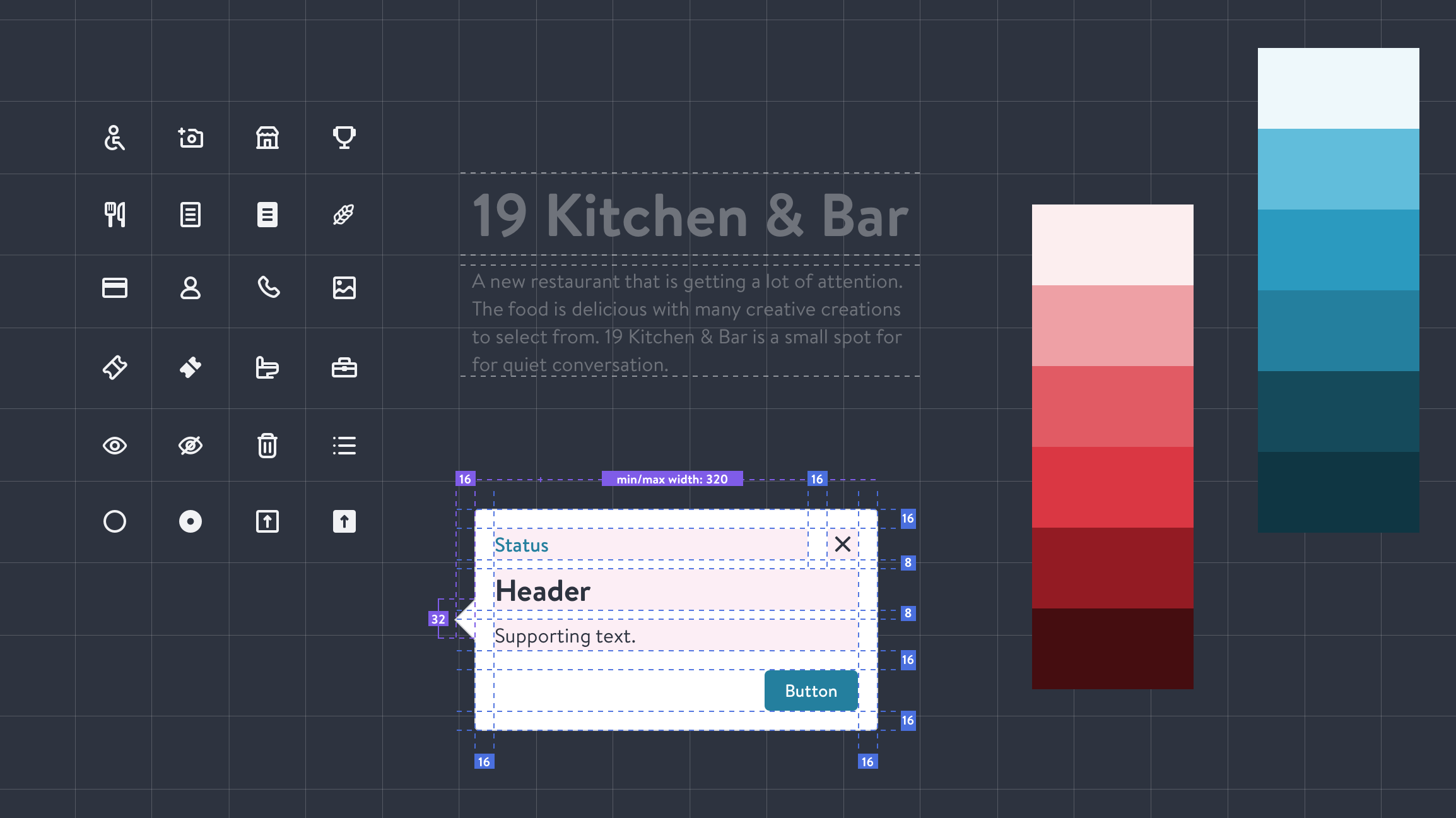
OTKitDesign system
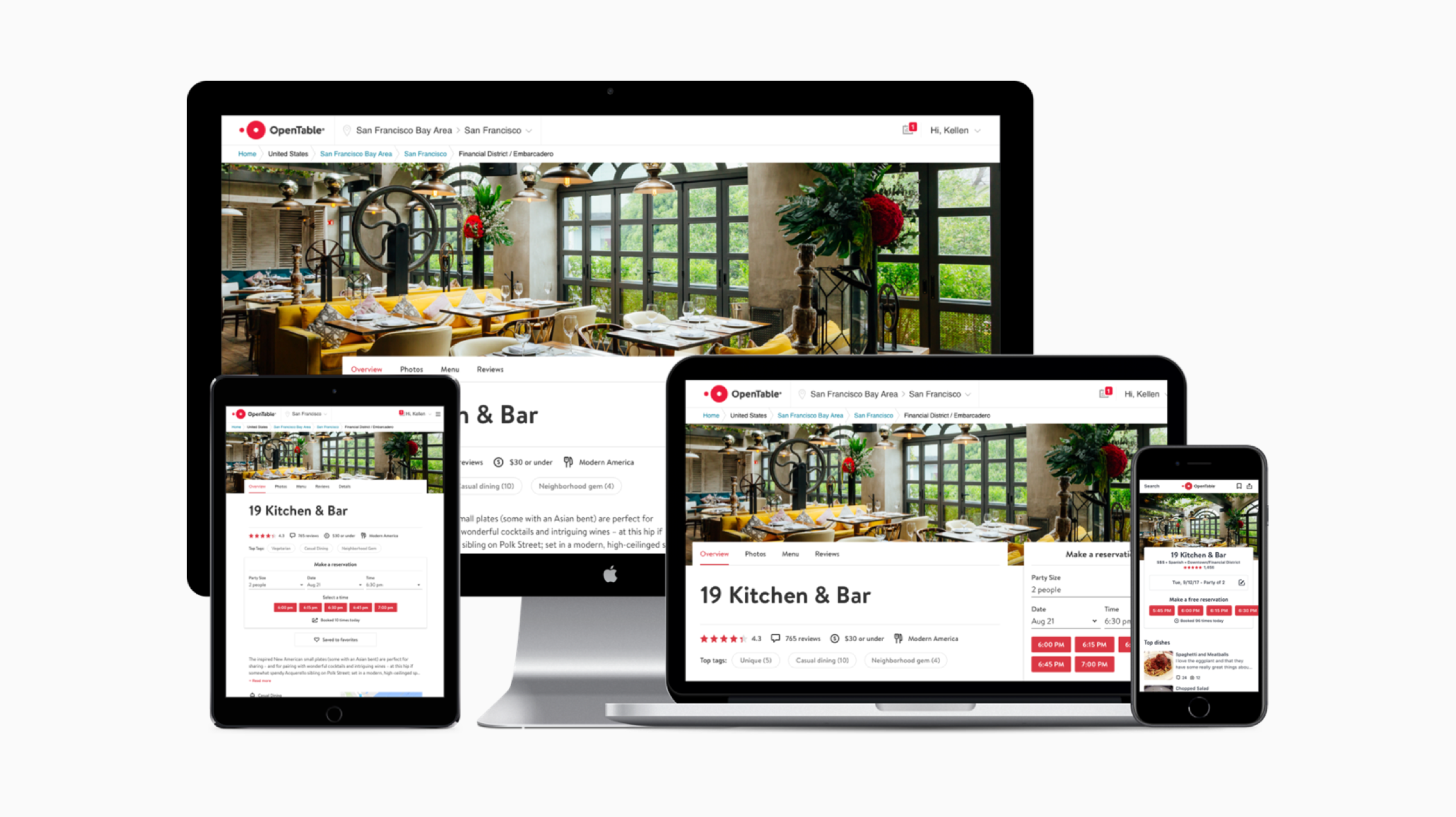
OpenTable RedesignProduct design

Visa Digital Commerce AppWhite label
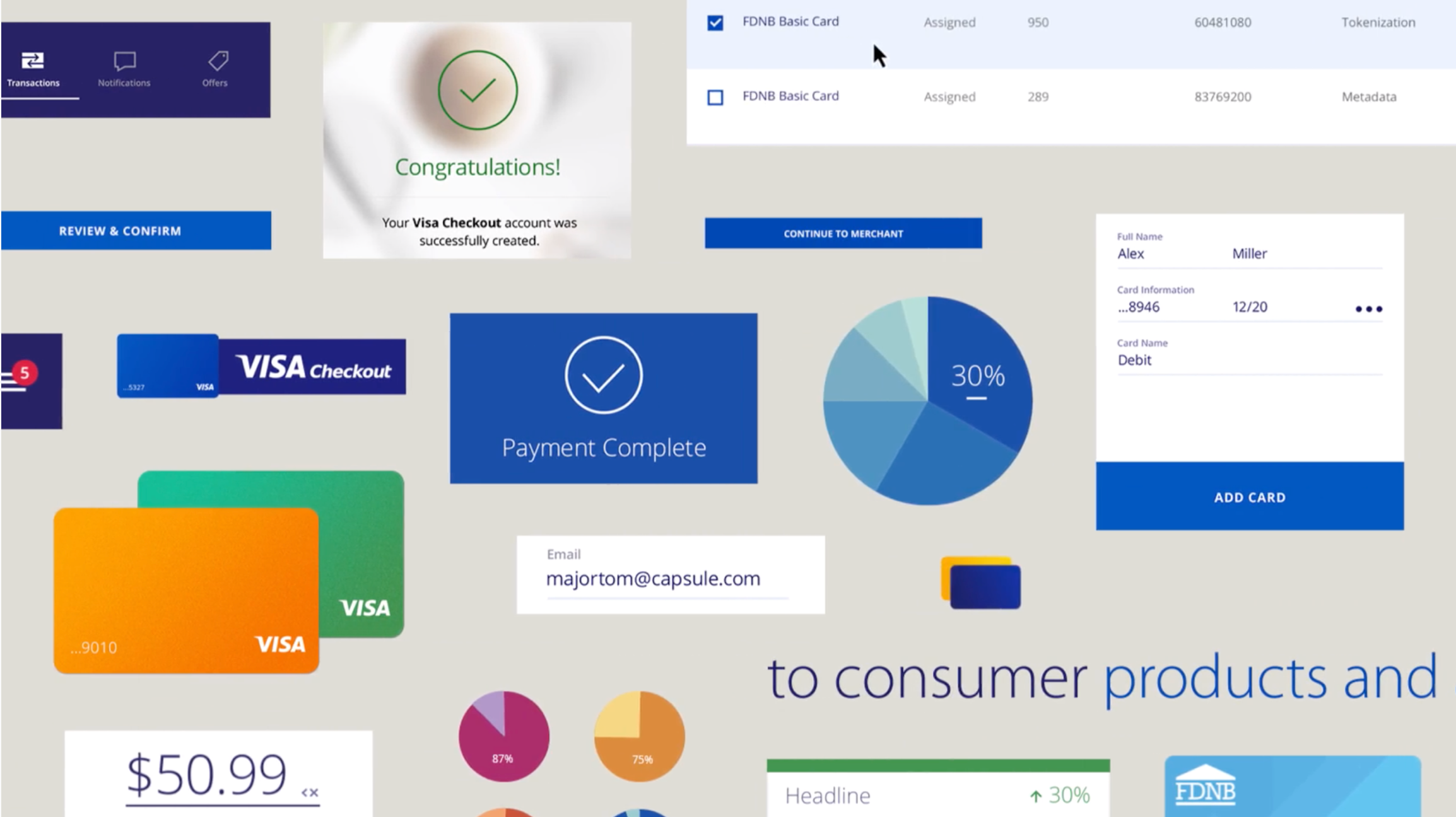
AtomDesign system
© 2020 | Resume
