OpenTable redesign
Goals
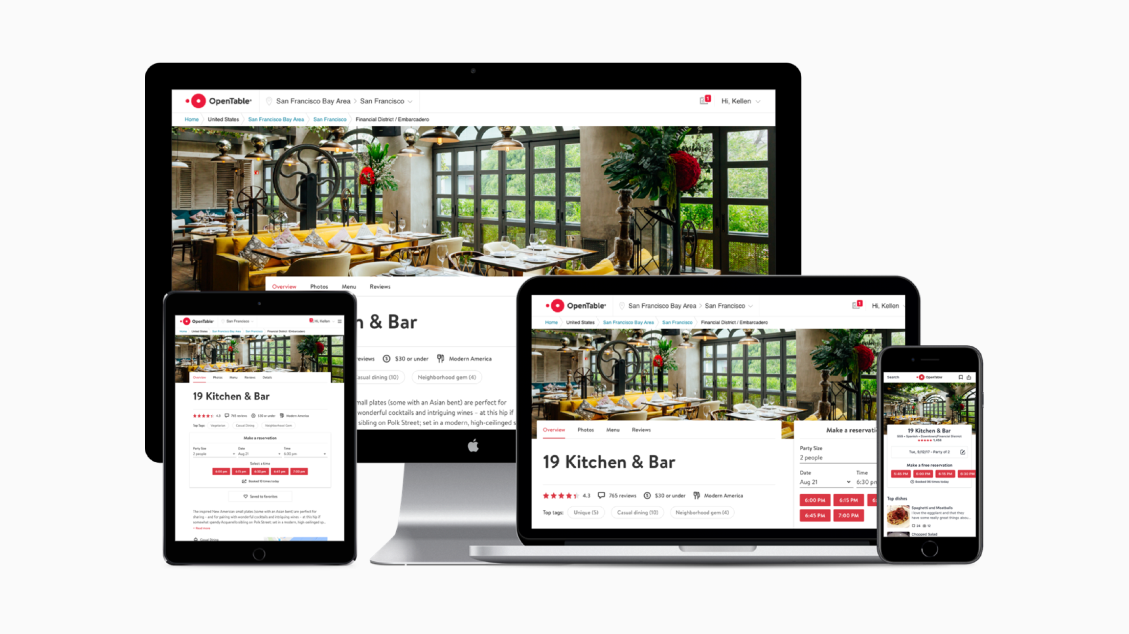
Position OpenTable as the most relevant and interesting source of truth for dining. Drive engagement by more page views, longer time spent of page, and less bounces.
Evolve the visual and interaction language of the OpenTable consumer experience. Create a design that is truly responsive and consider how the experience works across native app and responsive web experiences.
Challenges
Create a robust design solution that accounts for a variety of different states and information.
Consider the legacy a/b test results that we wanted to support when making design decisions.
Unify experience across consumer platforms on iOS, Android, and Web.
Principles
Workshop
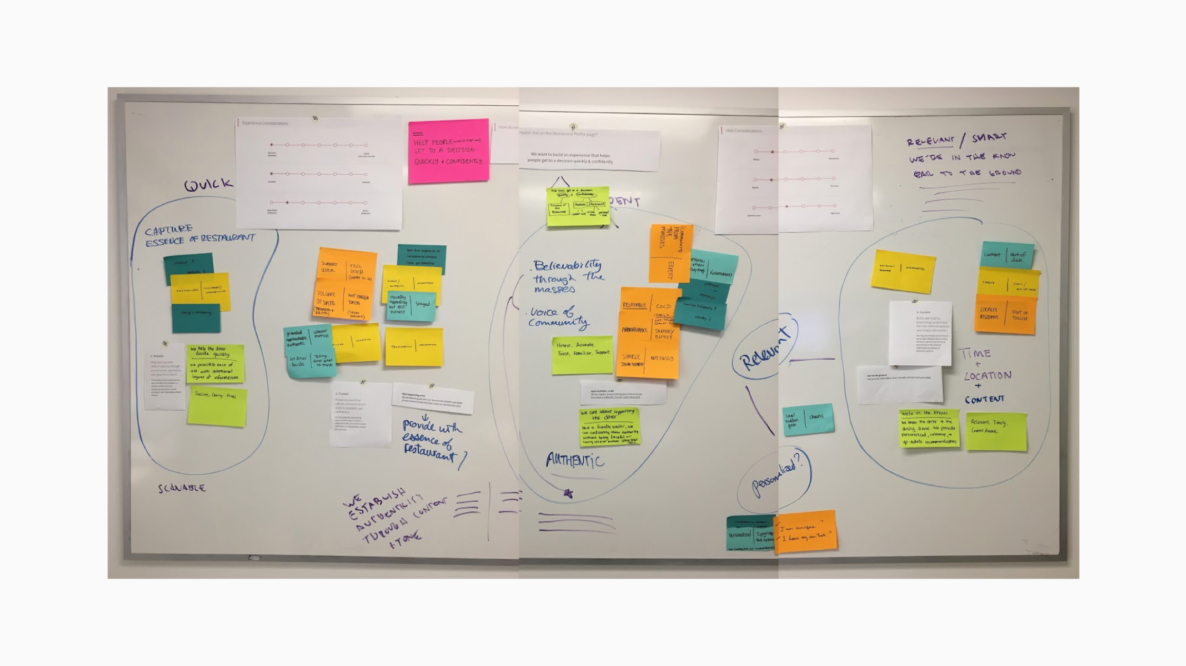
Before diving too deep, we gathered for a workshop to brainstorm principles to help guide our decision-making.

Build diner confidence by presenting content that is contextually and personally relevant.

Help diners quickly capture the essence of the restaurant by being concise and clear.

Present content that reflects an honest voice and tone in order to establish diner trust.
User testing
Existing design
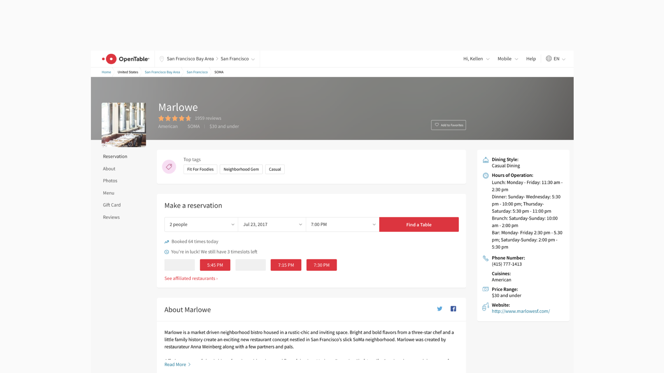
9/20 preferred existing page, 2/9 strongly preferred existing page.
“Some of the info such as the open/close time and the phone number was at the top where viewers can easily see it. One the first page, this important info was all the way at the bottom.” - User from usertesting.com user session
New design
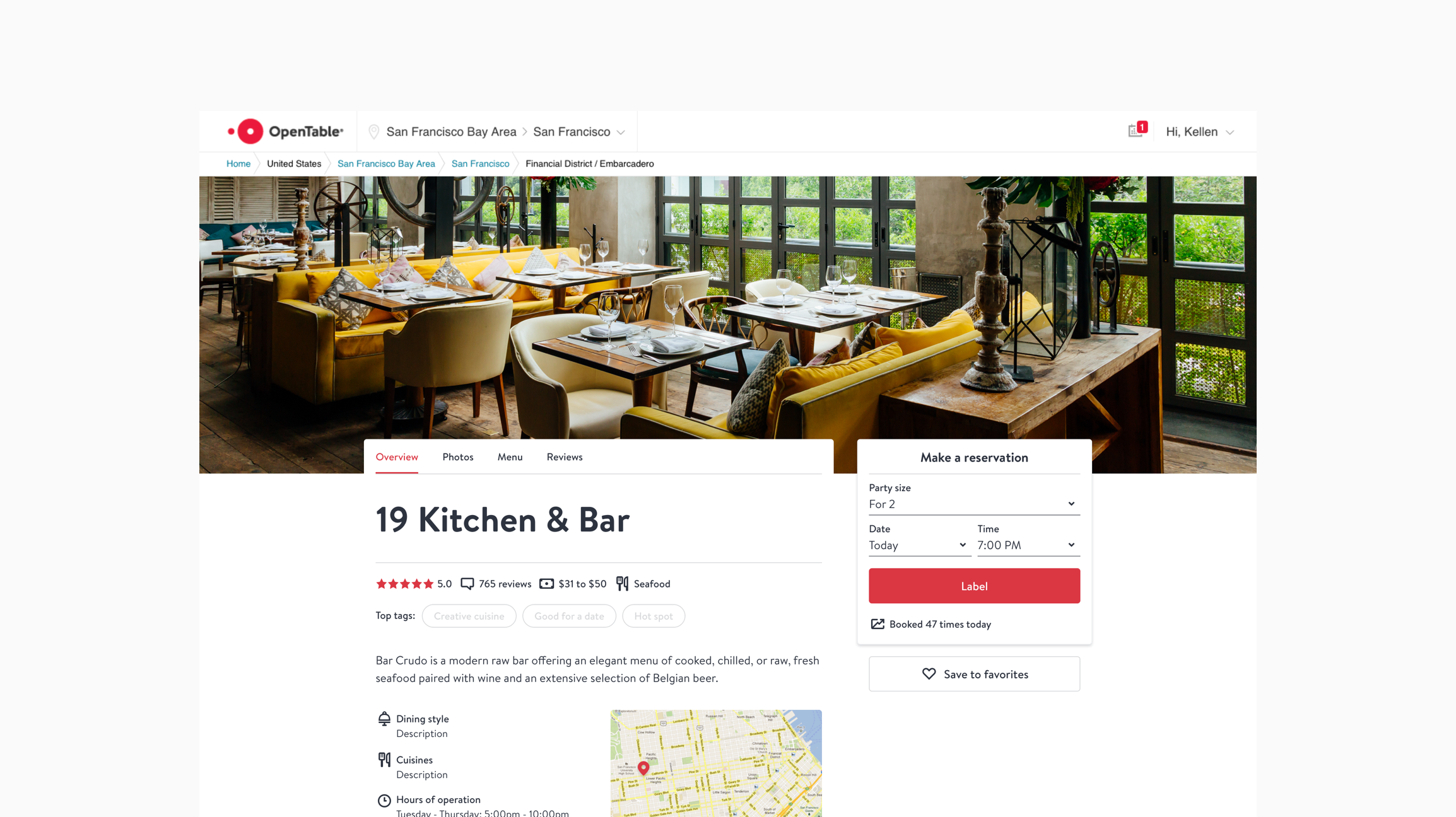
11/20 preferred new page, 8/11 strongly preferred new page.
“Overall the aesthetics were much more refined and felt elevated and like a site I would want to be engaging with as opposed to a grudging research task. The large scale of restaurant interior header photo was and inviting and lets me know in a mili-second if this is the kind of environment I want for a given evening.” - User from usertesting.com user session
Responsive model
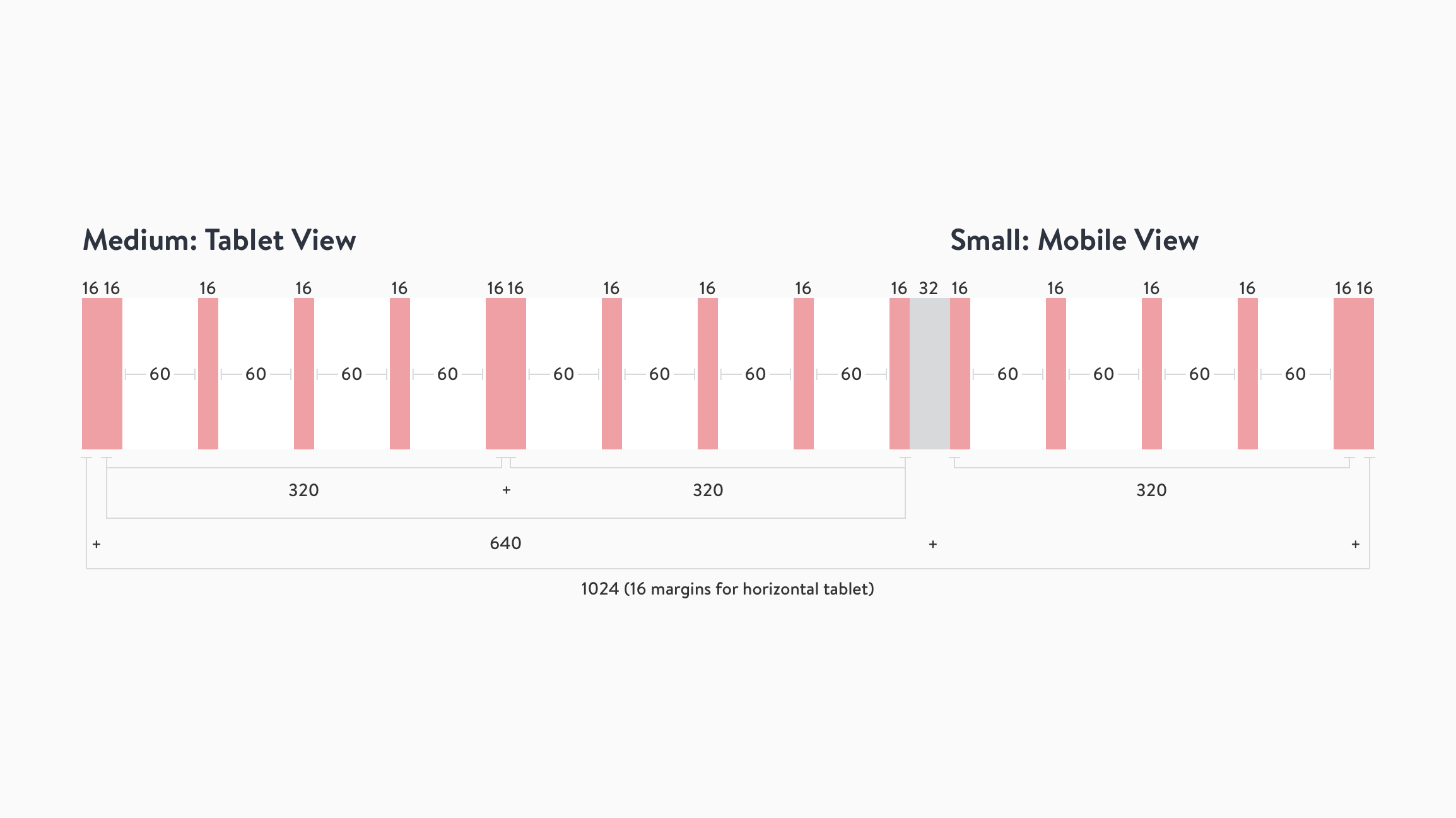
Grid system
The restaurant profile grid system leverages decisions made in our design system.
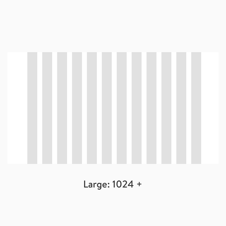
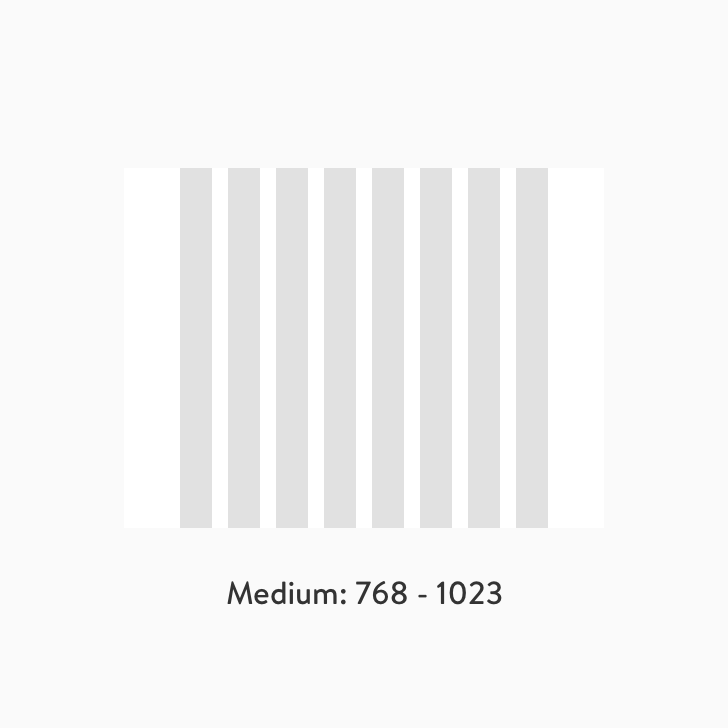
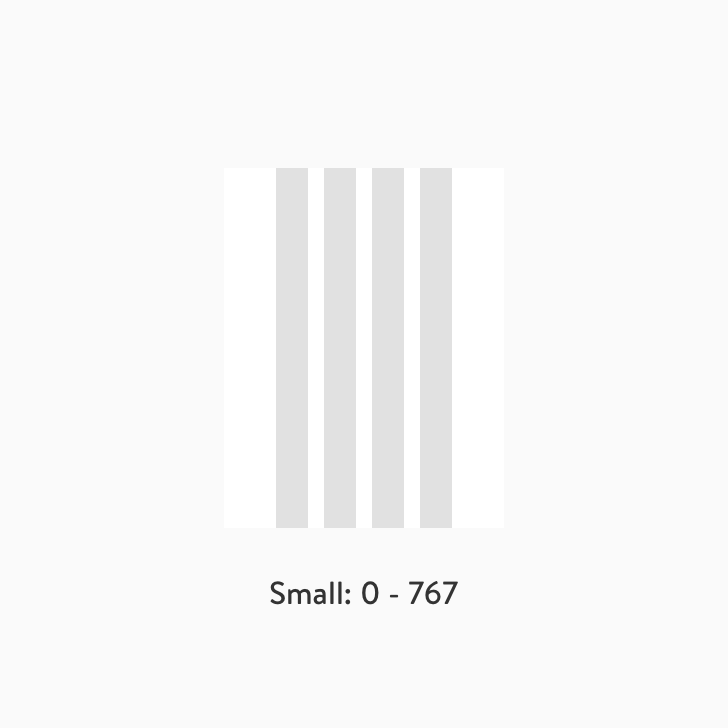
Breakpoints
Hero image logic
Desktop
Designing solutions for multiple vertical breakpoints ensures that the main actions are always available.
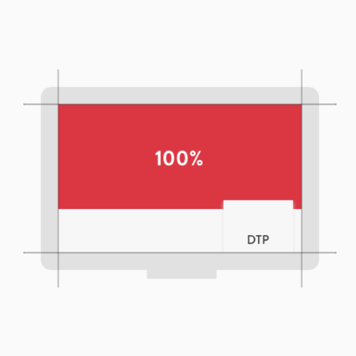
Large
100% of the image will be visible at the largest breakpoint.
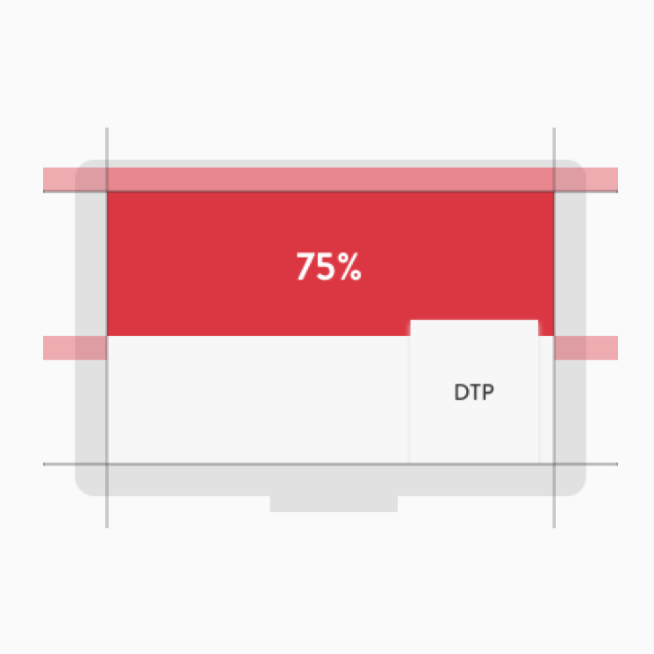
Medium
75% of the image will be visible, 25% will be cropped.12.5% cropped from the top and bottom of the image.
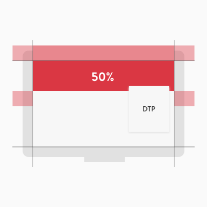
Small
50% of the image will be visible, 50% will be cropped. 25% cropped from the top and bottom of the image.
Tablet and mobile
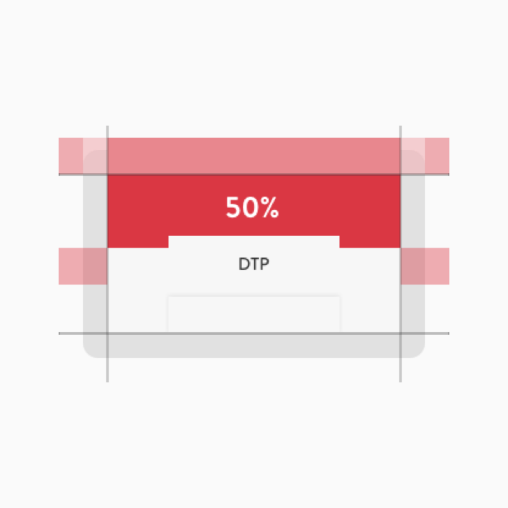
Horizontal tablet
50% of the image will be visible, 50% will be cropped. 25% cropped from the top and bottom of the image.
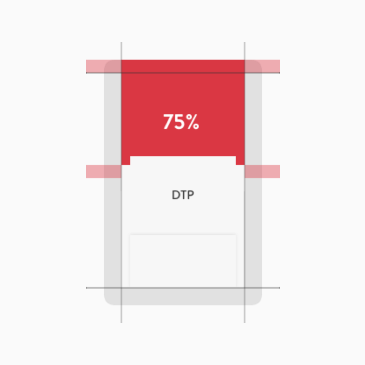
Vertical tablet
75% of the image will be visible, 25% will be cropped. 12.5% cropped from the top and bottom of the image.
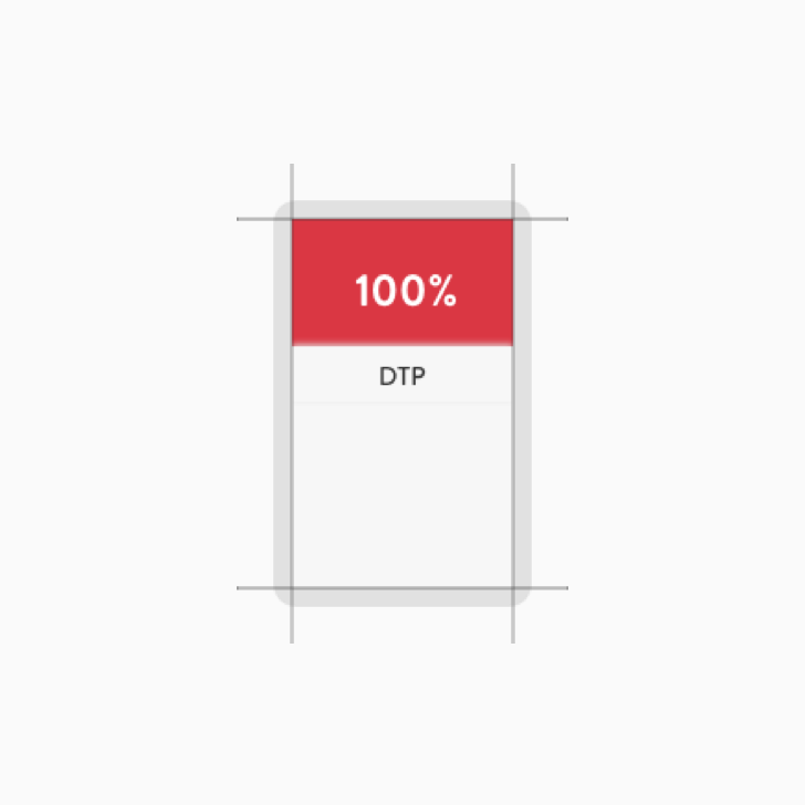
Mobile device
100% of the image will be visible at the largest breakpoint. Horizontal view isn't currently supported.
Result
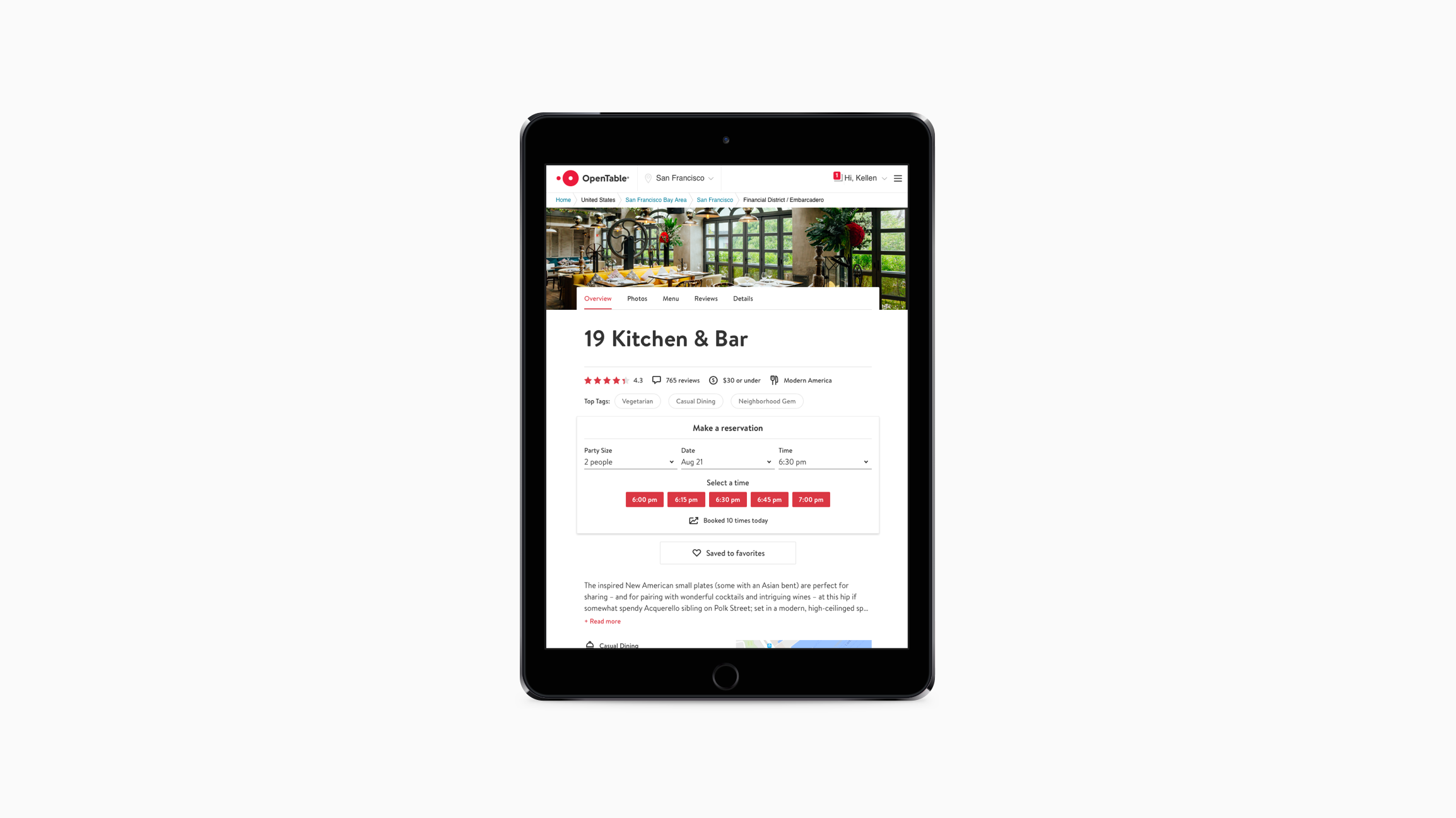
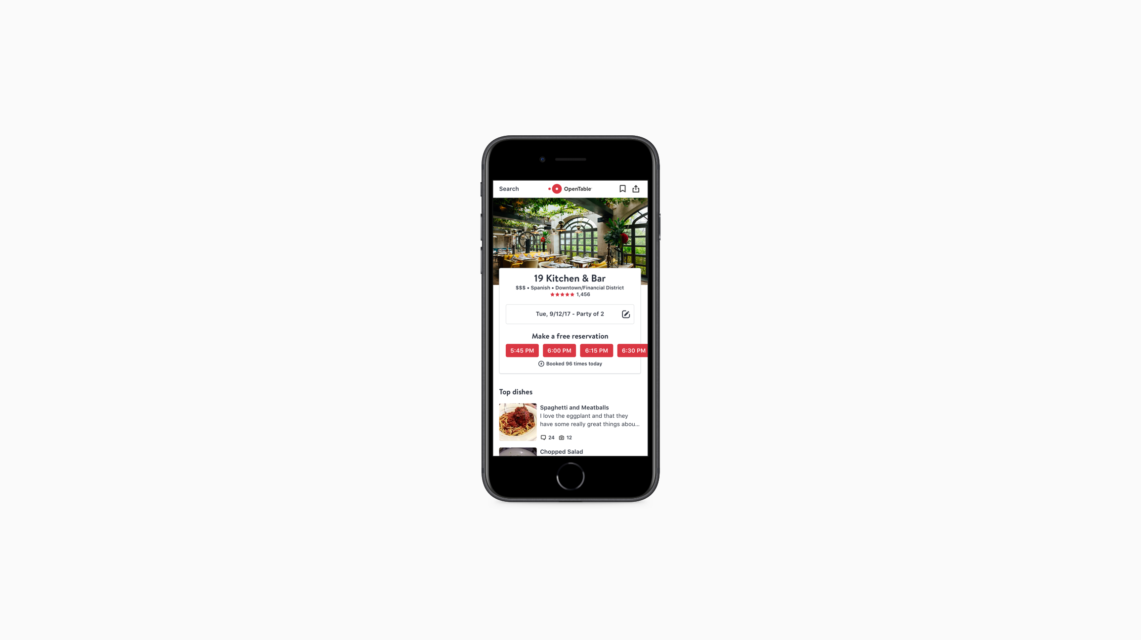
Conclusion
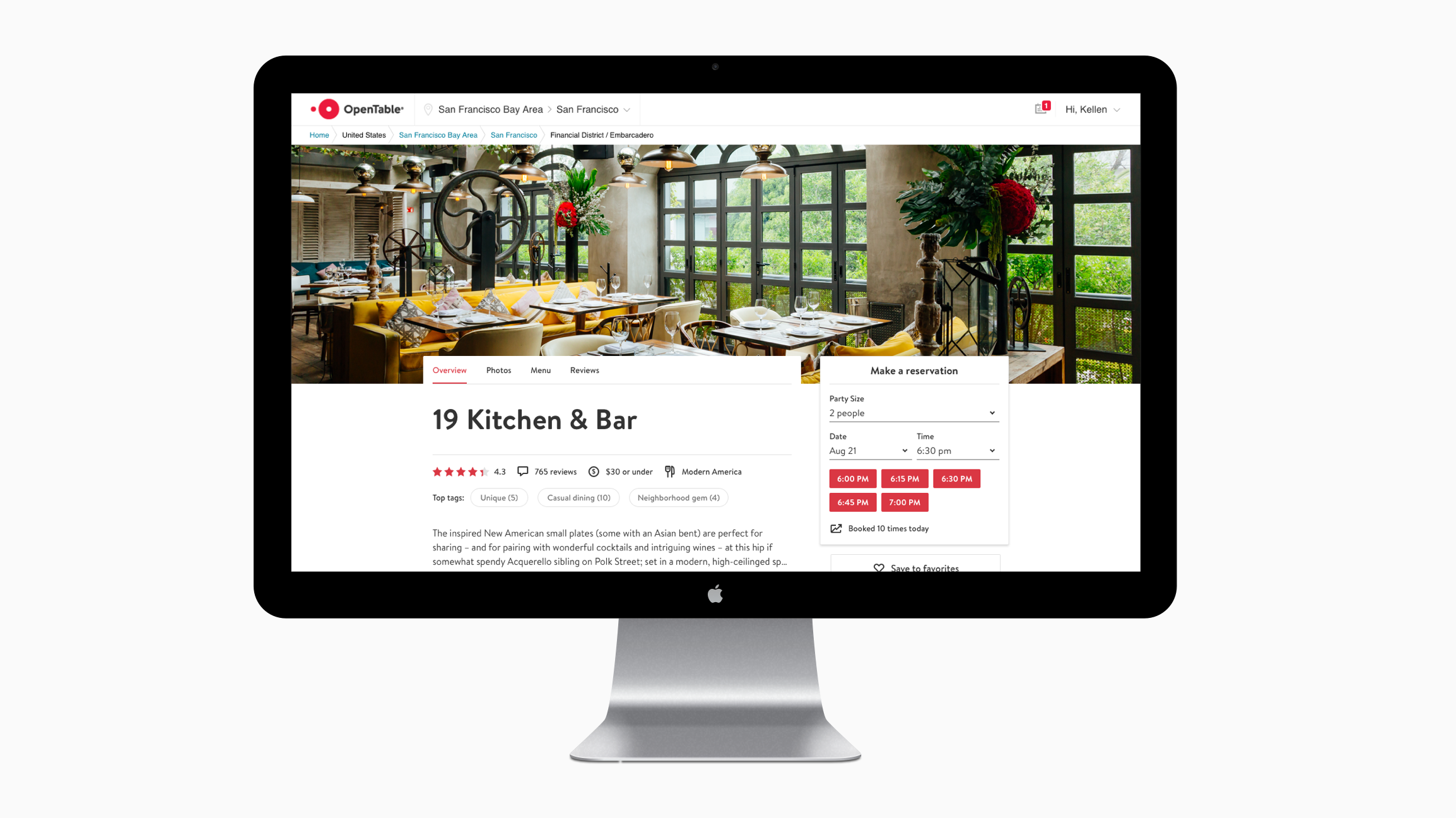
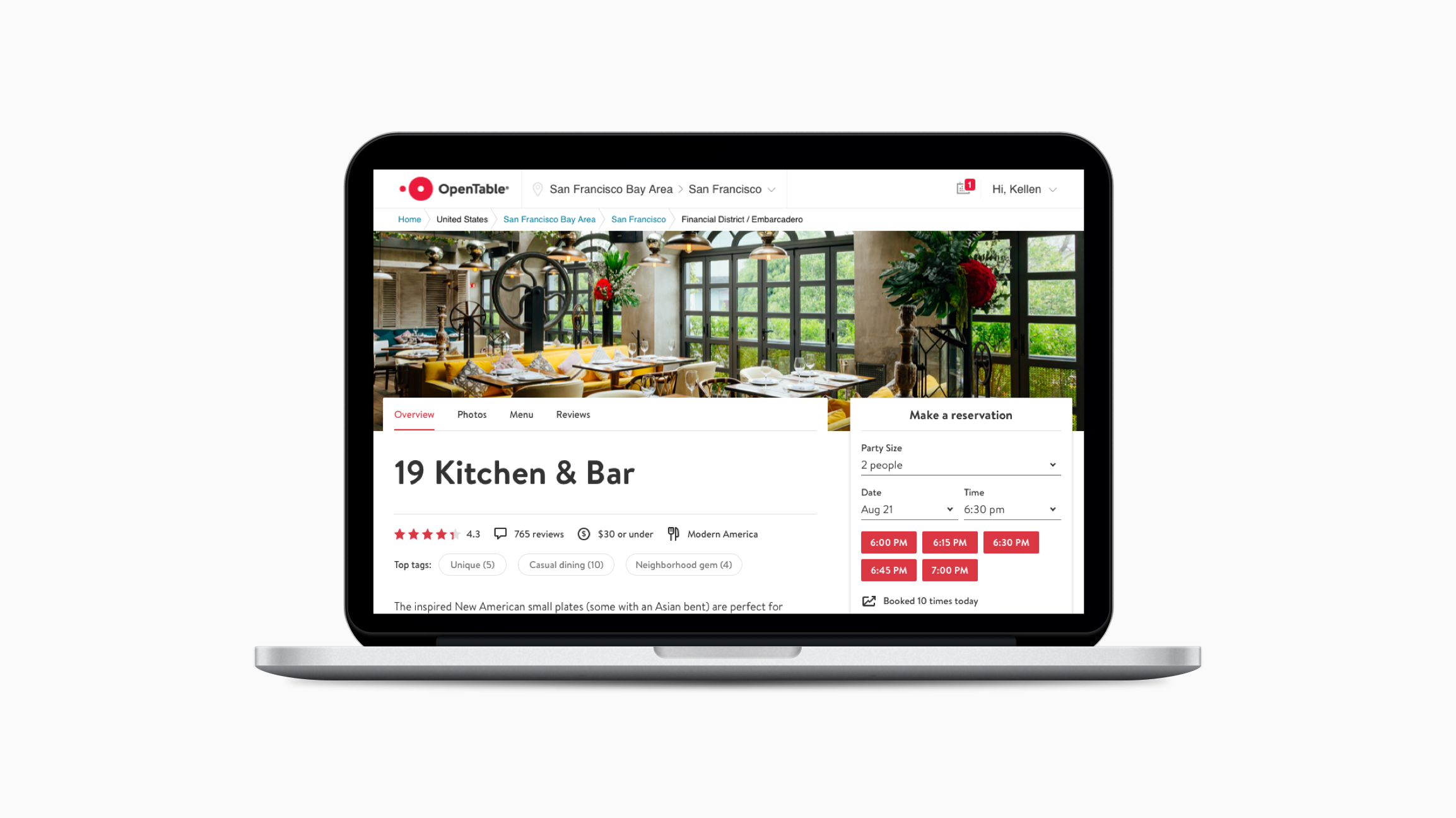
The results of user testing validated our investment to pursue the new design direction. This direction influenced building out key foundational rules in our design system, OTKit. Our design was released to nearly 40,000 restaurants and is being used as a primary marketing tool for their businesses.
Selected works
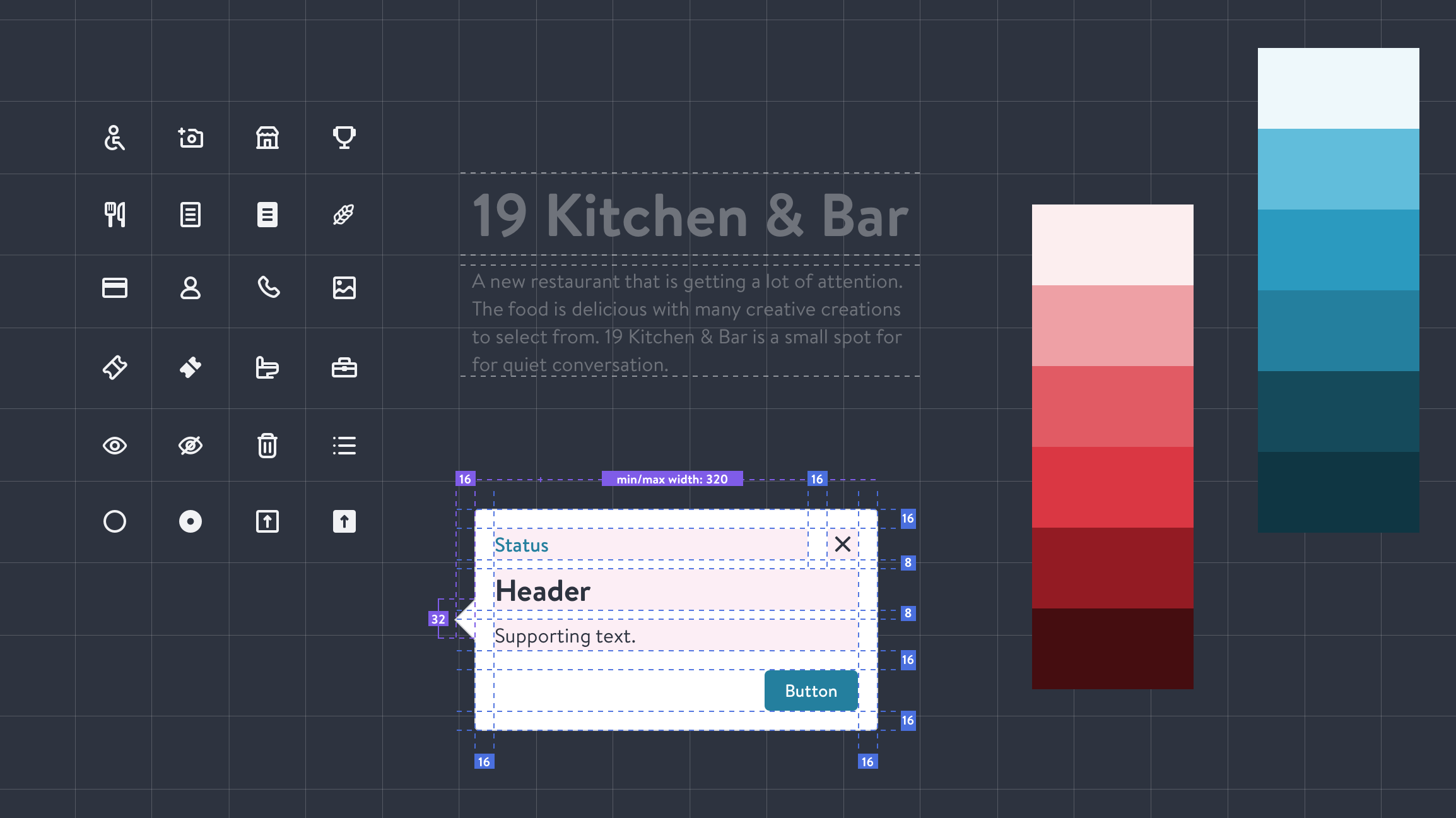
OTKitDesign system

OpenTable RedesignProduct design
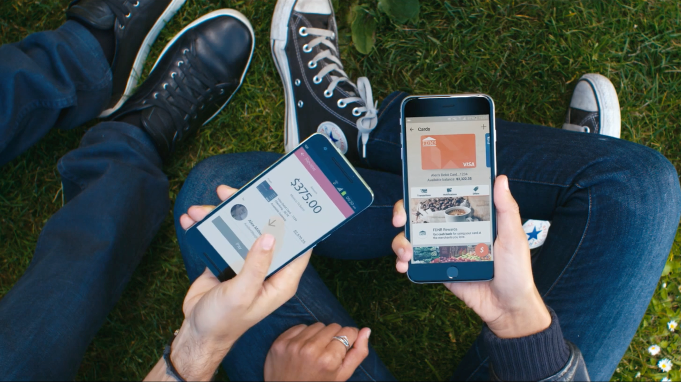
Visa Digital Commerce AppWhite label
AtomDesign system
© 2020 | Resume
